Trust Begins at Sign‑Up

First Impressions That Earn Belief
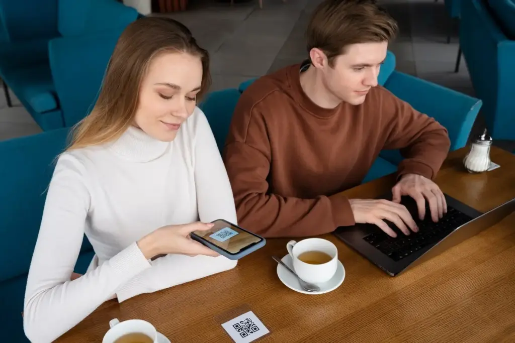
Frictionless Entry, Real Assurance
Use prefilled fields, smart scanning, and device-native capture to reduce taps while preserving rigor. Explain why each step matters before asking for it, and show progress that never resets. When friction must appear, anchor it in benefits, like faster approvals, stronger account recovery, and reduced support delays.
Show the Why, Not Just the What
People abandon when requests feel arbitrary or greedy. Pair every request with a plain reason, a privacy promise, and a small expiry note for retention. Add links to policies that humans can read in under two minutes, and offer an easy path to ask questions before proceeding.
A Short Story from a Busy Tuesday
A mid-market lender cut identity drop-off by half after reordering steps: selfie first, document second, address last. They displayed a friendly timer, clarified why liveness mattered, and promised immediate deletion of failed captures. Applicants wrote thank-you notes, and support tickets about confusion simply disappeared.
Security Without the Speed Bumps
Progressive Checks That Respect Context
Start with lightweight verification, then elevate only when signals disagree or the transaction value spikes. This preserves conversion while stopping fraudsters who probe thresholds. Communicate upgrades as protective collaboration, not punishment, and provide a clear retry path if lighting, bandwidth, or camera quality undermines liveness or OCR.
Clear Copy, Predictable Steps
Trade jargon for everyday language, place time estimates at the top of screens, and preview the next step before users finish the current one. Predictability lowers stress, especially for multilingual audiences and first-time investors, ensuring verification feels like guidance, not an exam with hidden rules or trick questions.
Graceful Recovery When Signals Conflict
Conflicting results are inevitable. Offer calm explanations, prioritized next actions, and the option to switch channels without starting from scratch. Give people safe pauses to gather documents, and keep previously accepted data intact. Recovery moments, handled kindly, become memorable proof that your trust process treats everyone with respect.

Consent That People Actually Understand

Collect Less, Protect More
Spotting Synthetic Identities Early
Liveness That Feels Natural
Documents That Tell the Truth
Stopping Fraud Before It Steals Trust
Trust You Can See, Hear, and Feel

Confidence You Can Measure


All Rights Reserved.